Accessing Dashboard
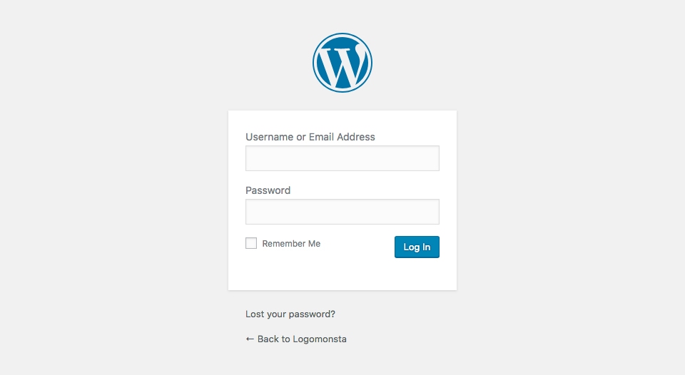
All wordpress websites come equipped with a content management system for ease of use. Accessing its dashboard is as simple as login in. The login page can be access by navigating to your domain forward slash wp-admin (http://example.com/wp-admin). Once accessed you will be prompted to enter your username and password. You can also reset your password using the "lost your password" link underneath the login fields
Dashboard Overview
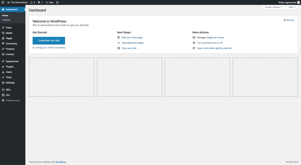
The wordpress adminstration dashboard give you a breif overview of your website as well as access to various tools and functions that you may need. In the menu located to the left you will be able navigate to various admin related sections I.E. pages, posts
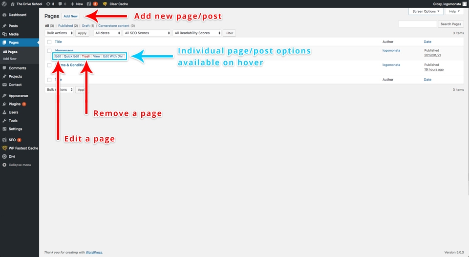
Pages & Posts (Articles)
Wordpress pages and posts are very similar. The dashboard for both looks quite similar the difference being the posts get categorised into a blog where as pages are their own seperate entity.
The Visual Builder?
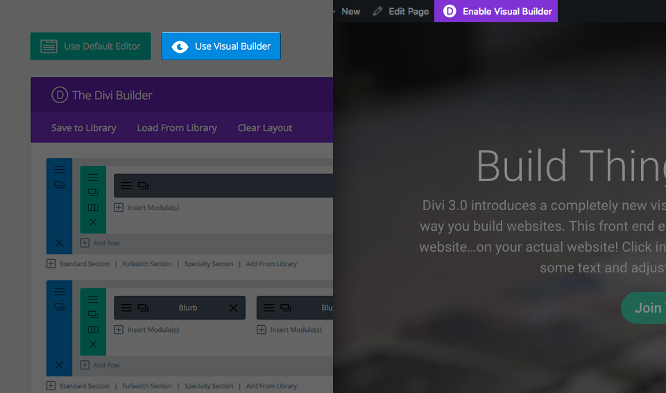
The Builder comes in two forms: The standard "Back-end Builder" and the front-end "Visual Builder." Both interfaces allow you to build exactly the same types of websites with the same content elements and design settings. The only difference is the interface. The Back-end Builder lives inside of the WordPress Dashboard and it can be accessed along with all of the other standard WordPress settings. It sits inside the WordPress UI and replaces the standard WordPress post editor. It's great for making quick changes while you are inside the dashboard, but it's also confined by the dashboard and is rendered as a block-based representation of your website. This tutorial will be focusing only on the visual builder.
The all new Visual Builder, on the other hand, allows you to build your pages on the front-end of your website! It's an amazing experience and allows for much faster design. When you add content or adjust design settings inside the visual builder, your changes appear instantly. You can click onto the page and just start typing. You can highlight text and adjust its font and style. You can add new content, build your page and watch everything happen right before your eyes.
Enabling The Visual Builder
While you are logged in to your WordPress dashboard, you can navigate to any page on the front-end of your website and click the "Enable Visual Builder" button in the WordPress admin bar to launch the visual builder.
If you are editing your page on the back-end, you can switch to the visual builder by clicking the "Enable Visual Builder" button that sits at the top of the back-end Builder interface (note, you must first enable the Builder before the visual builder button will appear).
The Visual Builder Basics
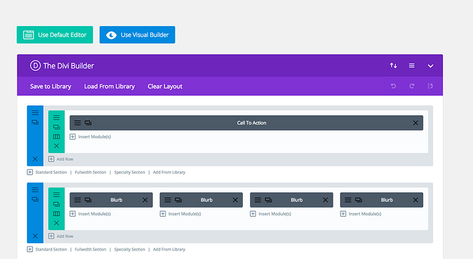
The page builder's power lies in the Visual Builder, a drag and drop page builder that allows you to build just about any type of website by combining and arranging content elements.
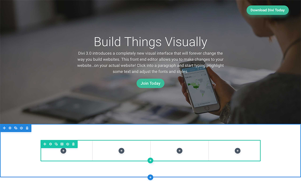
The builder uses three main building blocks: Sections, Rows and Modules. Using these in unison allows you to create a countless array of page layouts. Sections are the largest building blocks, and they house groups of rows. Rows sit inside of sections and are used to house modules. Modules are placed inside of rows.
Sections
The most basic and largest building blocks used in designing layouts with the builder are sections. These are used to create large groups of content, and they are the first thing you add to your page. There are three types of sections: Regular, Specialty and Full Width. Regular sections are made up of rows of columns while Full Width Sections are made up of full width modules that expand the entire width of the screen. Specialty sections allow for more advanced sidebar layouts.
Rows
Rows sit inside of sections and you can place any number of rows inside a section. There are many different column types to choose from. Once you define a column structure for your row, you can then place modules into a desired column. There is no limit to the number of modules you can place within a column.
Modules
Modules are the content elements that make up your website. Every module that the builder has can fit into any column width and they are all fully responsive.
Building Your First Page
The three basic building blocks (Sections, Rows and Modules) are used to build your page.
Adding Your First Section
Before you can add anything to your page, you will first need to add a section. Sections can be added by clicking the blue (+) button. When you hover over a section that already exists on the page, a blue (+) button will appear below it. When clicked, a new section will be added below the section you are currently hovered over.
If you are starting a brand new page, then your first section will be added automatically.
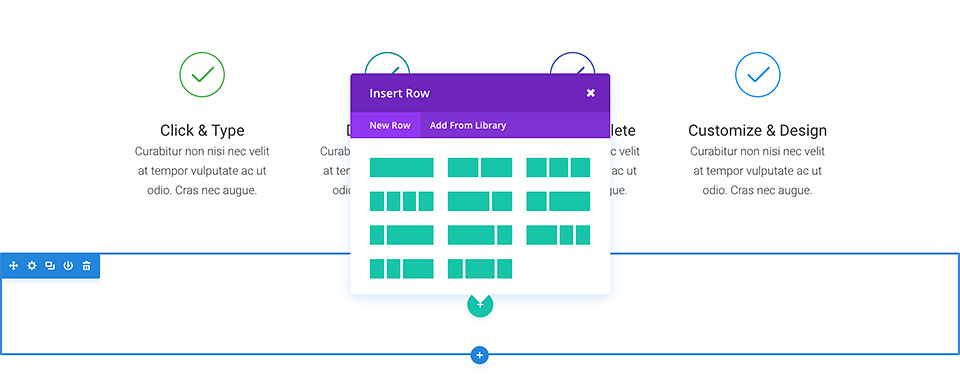
Adding Your First Row
After you have added your first section you can start adding rows of columns inside of it. A section can house any number of rows, and you can mix and match rows of varying column types to create a variety of layouts.
To add a row, click the green (+) button inside of any empty section, or click the green (+) button that appears when hovering over any current row to add a new row below it. Once you have clicked the green (+) button you will be greeted with a list of column types. Choose your desired column and then you are ready to add your first module.
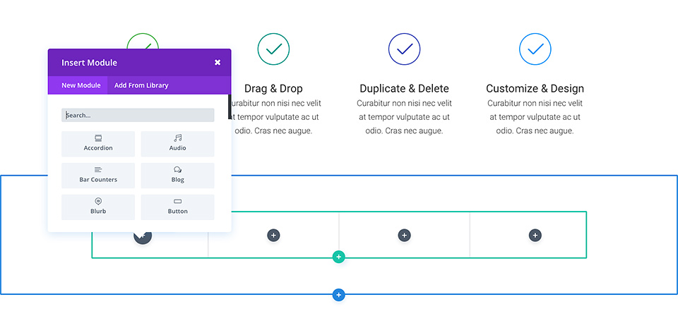
Adding Your First Module
Modules can be added inside of rows, and each row can house any number of modules. Modules are the content elements of your page, and the builder comes with over 40 different elements that you can use to build with. You can use basic modules such as Text, Images and Buttons, or more advanced modules like Sliders, Portfolio Galleries and eCommerce Shops.
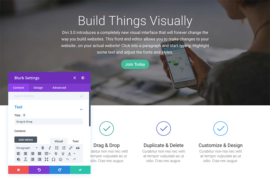
To add a module, click the gray (+) button that exists inside of any empty column or click the gray (+) button that exists when hovering over a module on the page to add a new Module below it. Once you have clicked the button, you will be greeted by a list of modules. Pick your desired module and it will be added to your page and the settings panel for the module will appear. Using this settings panel, you can begin configuring your module.
Configuring And Customizing Sections, Rows And Module
Each section, row and module can be customized in various ways. You can access an element's settings panel by clicking the gear icon that exists when hovering over any element on the page.
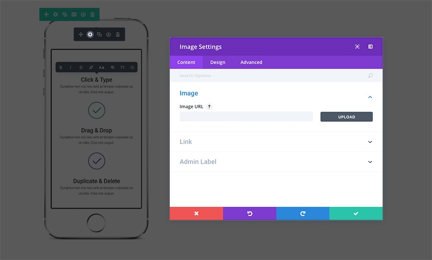
This will launch the settings panel for the specified element. Each settings panel is broken up into three tabs: Content, Design, and Advanced. Each tab is designed to make accessing and adjusting the builder's large variety of settings quick and easy. The Content tab of course is where you can add content such as images, video, links, and admin labels. The Design tab is where we've place all of the built-in design settings for each element. Depending on what you're editing you can control a wide variety of design settings with a click; including: typography, spacing (padding/margin), button styles, and more. For an in-depth look at the Design tab. Finally, if you want even more control you can head over to the Advanced tab where you can apply custom CSS, adjust visibility based on device, and (depending on which element you're editing) do even more fine tuning.
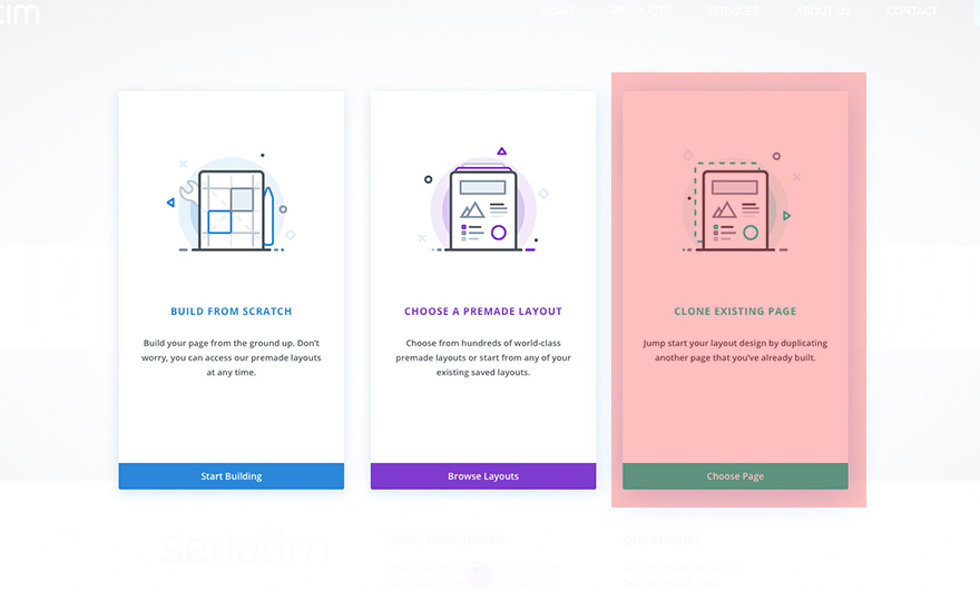
Duplicating Pages
Duplicating pages is a simple process and can be done via 2 methods.
Method 1 is on page creation. After creating a new page and navigating to the page builder select clone existing page. This will bring up the clone page selector
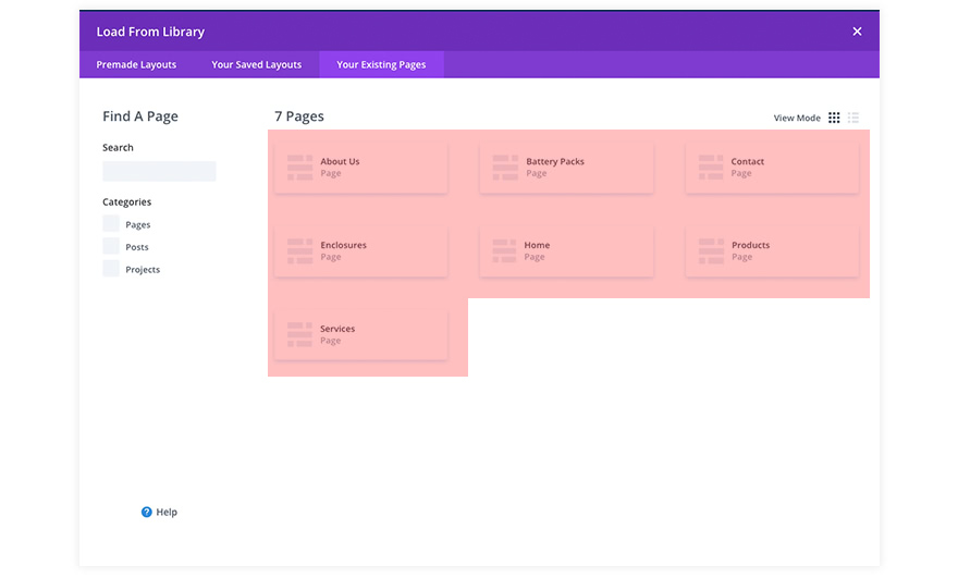
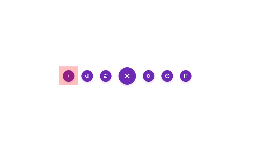
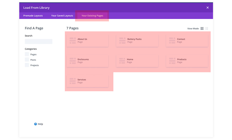
Method 2 is after page creation. Select a page and load the page builder. Select the purple button located at the bottom center of the screen. Then hit the load from library "+" button. Navigate to "Your existing Pages" tab and select the page you would like to duplicate
Updates & Saving
Remeber once you have made your updates you will need to save by hitting the save button or using the save shortkey
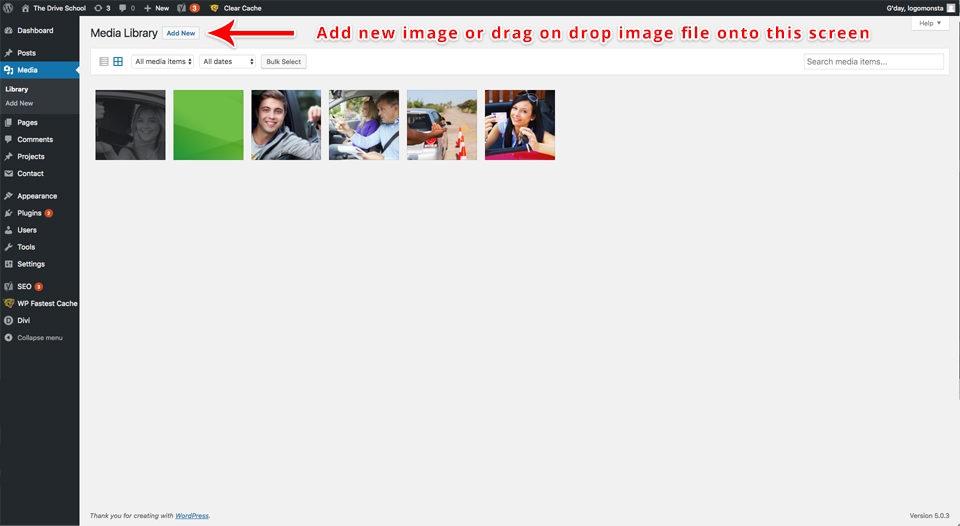
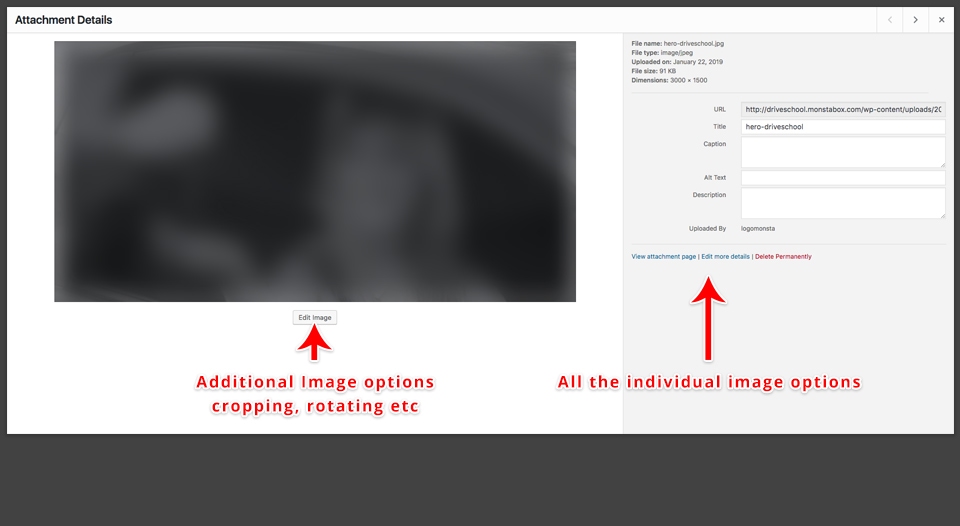
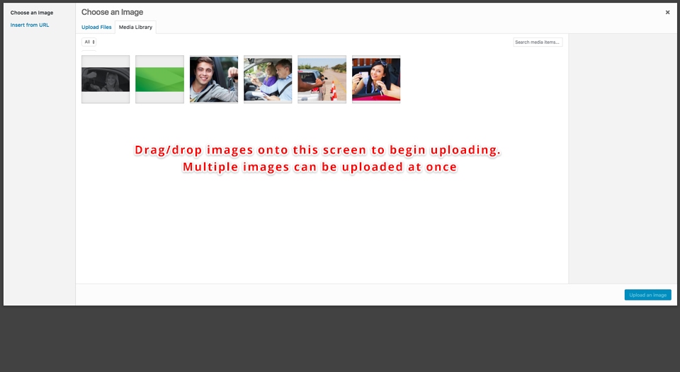
Adding Images
Uploading images is as simple as dragging + dropping images from your computers desktop. Simply navigate to the media section of the dashboard and begin dropping your images onto the screen. You can also modify and remove images by simply selecting one
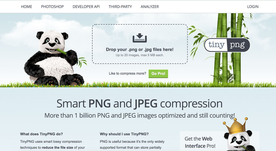
Compressing Images
Compressing images will help reduce your websites size and increase speed. A great website to compress images is TinyPNG. Simply drag an image onto tinypng and it will reduce the filesizes greatly.
Sizing Images
Another good practice for images is to constrain the image dimensions to the area your uploading too. This can be done with a photo editor like Paint.NET or Photoshop. A standard image from a camera is roughly 5000x5000 in dimension and 5mbs in size. Compressesing and reducing image size can reduce an image too 2-5% of it's original size